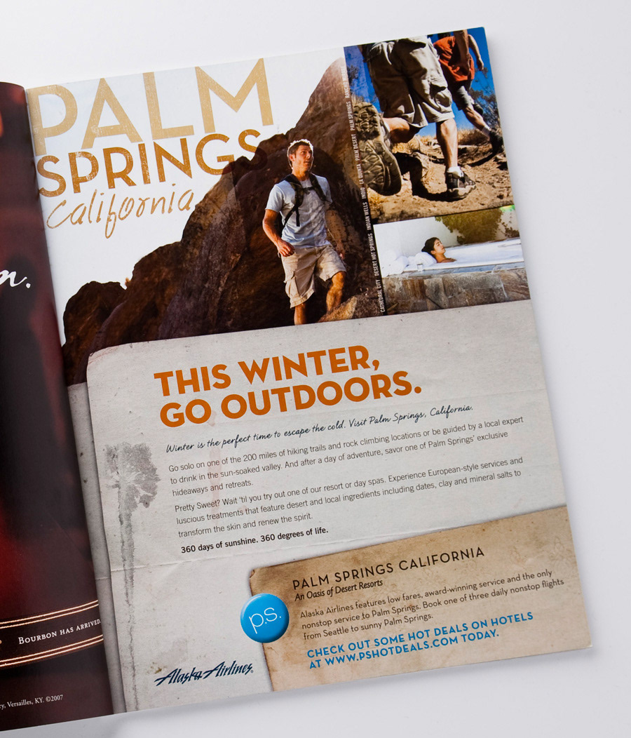
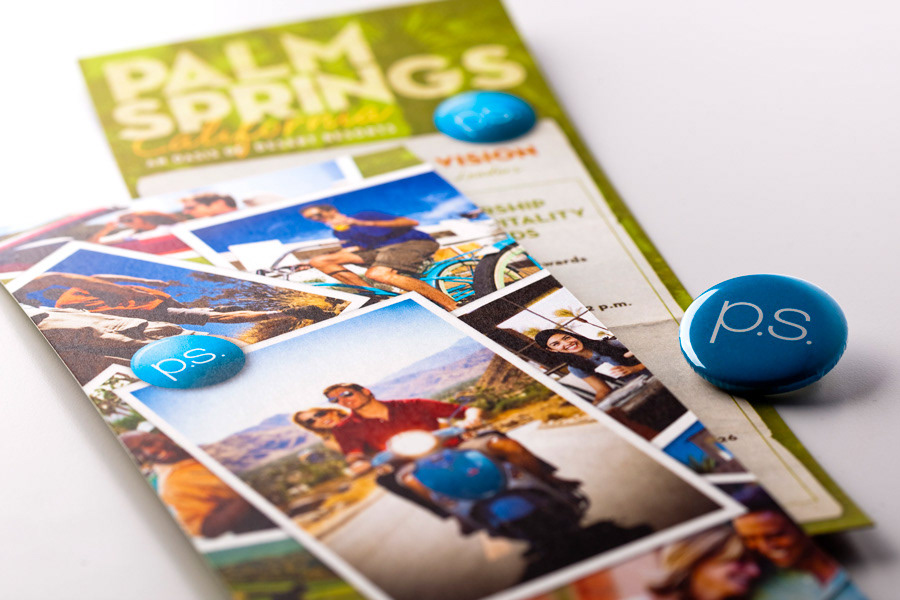
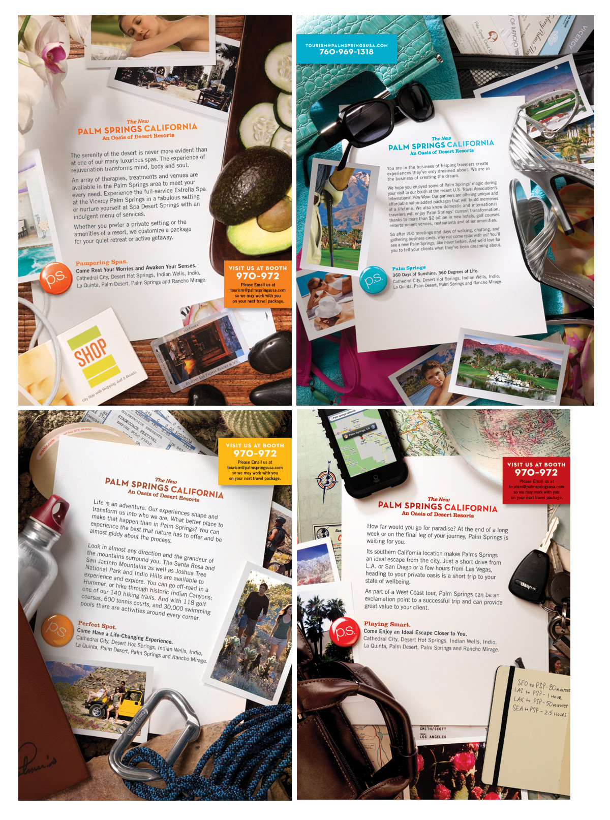
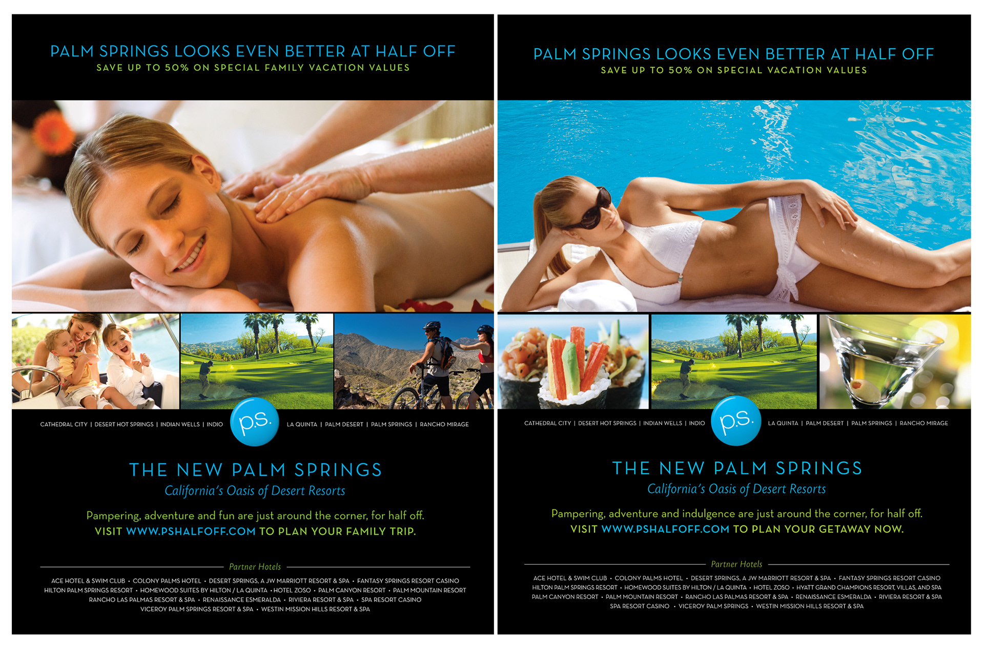
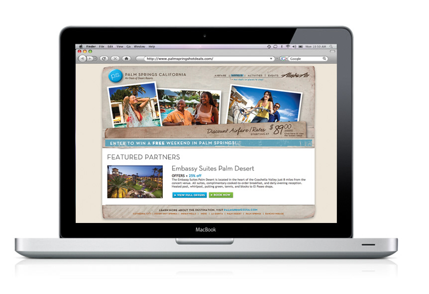
We developed four critical message zones related to Value (both economics and proposition), New/Current/Hip, Accessibility/Proximity, and Beauty and Experience. We emphasized these four pillars in the messaging and created a new logo, positioning statement, a P.S. “button” icon and secondary language building off the P.S. i.e. Pristine Setting, Pampering Spas, Perfectly Situated, etc. We developed both digital/online and print to endure consistency and reinforcement of the new look and branding for the destination.